2048 Puzzle – UX & UI Case Study
Redesigning a classic puzzle game with a focus on accessibility, engagement, and user delight. Built in Figma, achieving 30K+ downloads on Play Store.
Project Overview
This project was about rethinking the popular 2048 puzzle game from a UX perspective. While many versions exist, most lacked key features like dark mode, engaging interactions, and visual polish. My role covered UX research, UX design, and UI design. The game was prototyped in Figma—repurposing a design tool for functional game outcomes.
Research Insights
- Players wanted dark & light mode options to reduce eye strain.
- Most competitors had no sound feedback.
- Games felt bland and repetitive without small dopamine triggers.
- Undo moves were usually limited to 2 steps; we introduced 4 steps.
- Minimal UI variation across versions—few attempts at improving immersion.
Design Goals
Accessibility
Provide dark & light modes for flexible play conditions.
Engagement
Add sounds and micro-interactions to keep players motivated.
Challenge
Introduce 4-step undo for fair but exciting gameplay.
Delight
Move beyond bland visuals with a playful and modern UI.
Final Designs
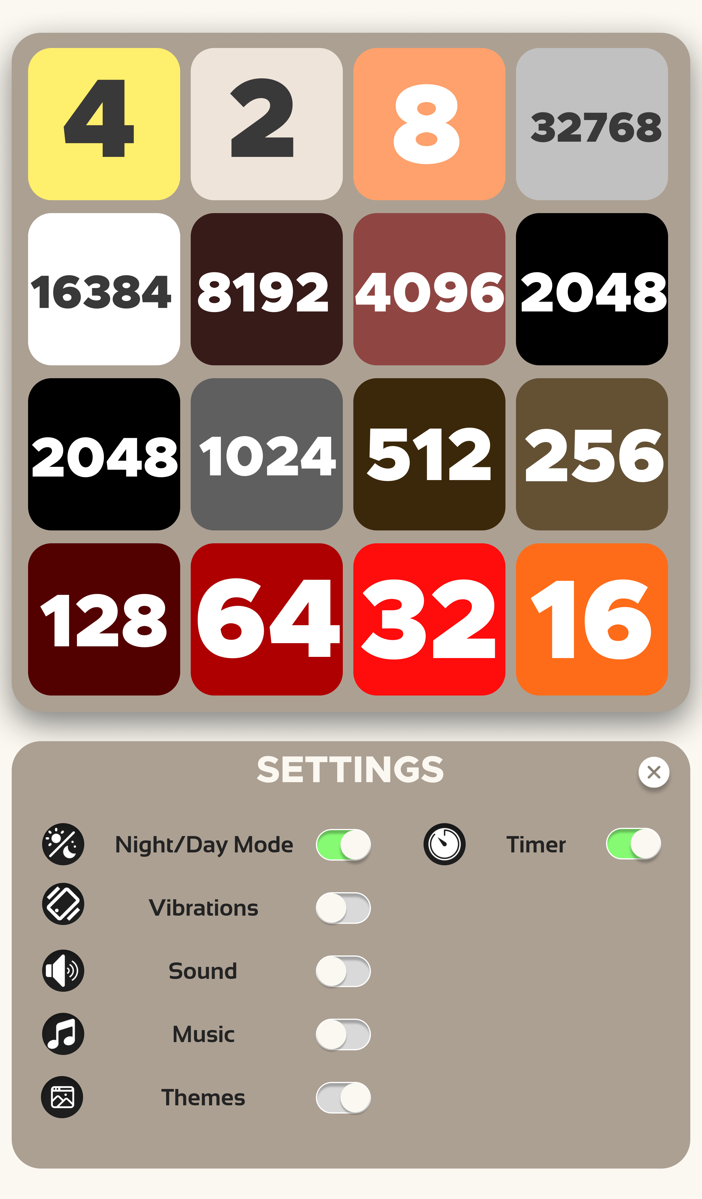
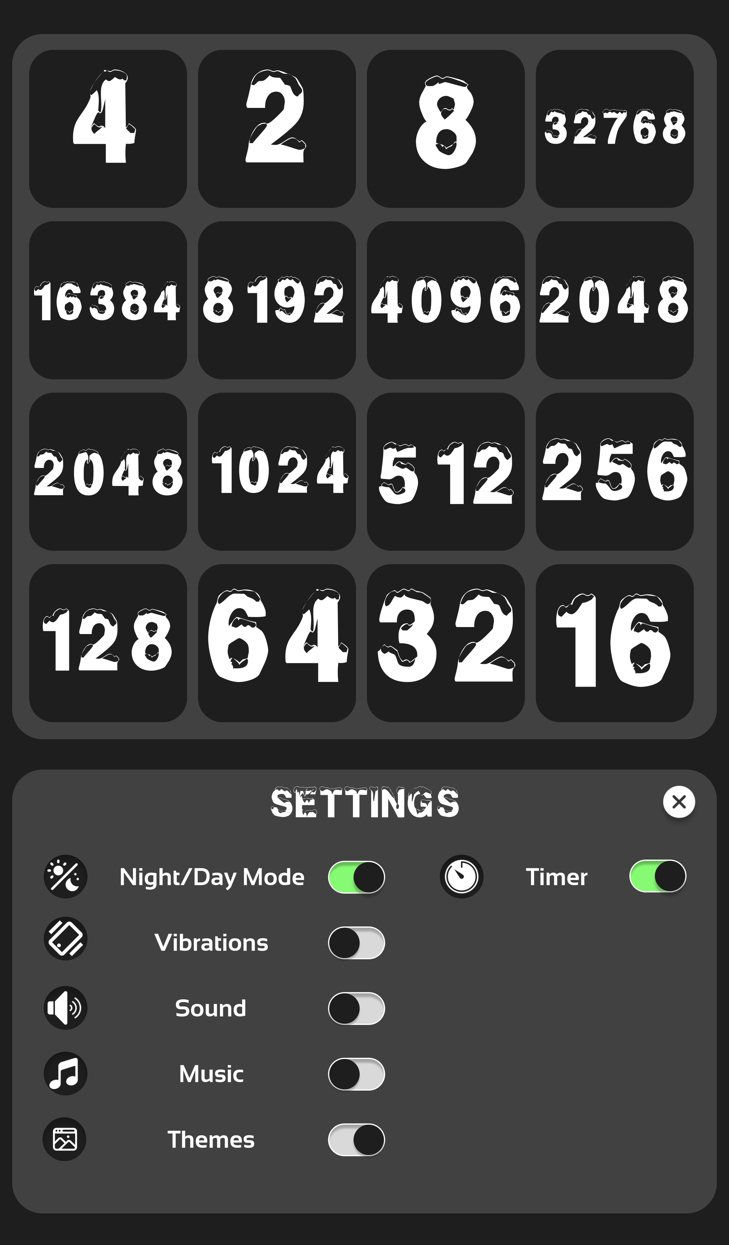
Outcomes
- Game reached 500+ downloads on Play Store.
- Positive user reviews highlighted design and usability.
- Validated that even with limited coding, thoughtful design drives adoption.
Reflection
This project taught me how much impact design alone can have on user engagement. Using Figma for game prototyping pushed me to be resourceful and rethink tools beyond their typical use cases. It also confirmed my growing interest in Human–Computer Interaction and how design can shape user behavior in subtle but powerful ways.